Redesigning my website for 2022, inspired by... trains?
Much like the shoemakers' children, my website has received very little of the same attention and care that I give to my professional work. Typically I've booted up a page in a single day, reaching for whatever framework or styles look the easiest and calling it at that. This year I wanted to return to my design roots and take a crack at making something for myself that I'd be proud of.
Before we dive in much further, I won't be writing about how I made my website. It's Next.js, Tailwind, and AirTable. A tale we've heard countless times and not something I need to add to the internet.
I started the design process by consulting with Jana, my significant other and incredibly talented art director. I haven't focused on just design in so long that I felt out of touch. Where do I start? A simple mood board was her suggestion.
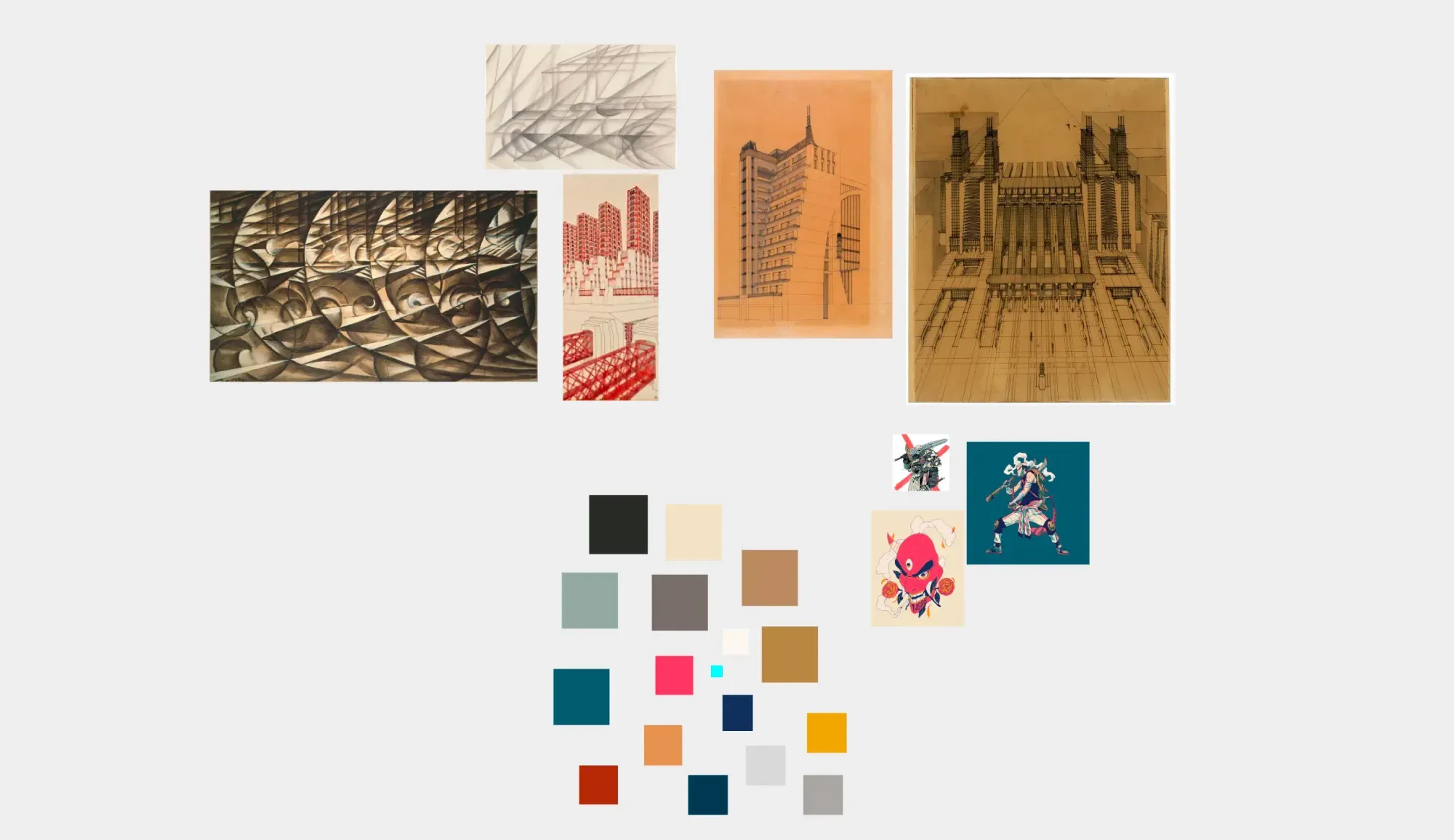
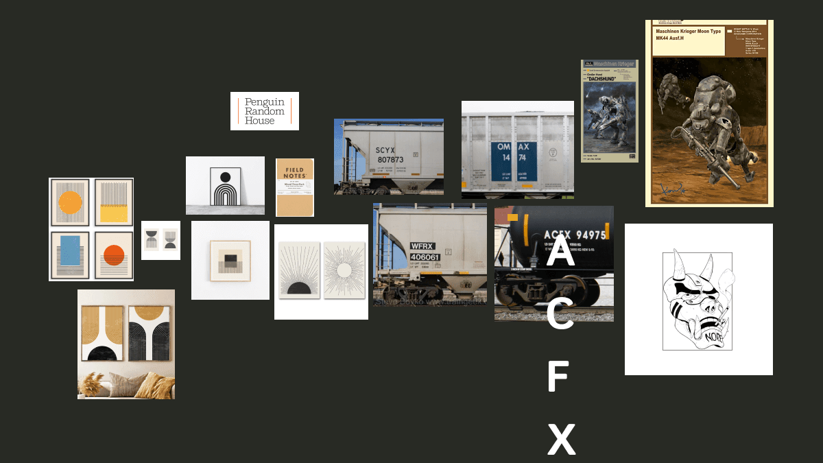
I gathered examples from artists, packaging I like, and, surprisingly, trains. Now, I don't have some fascination with trains; I'm not a train guy (no harm in being one) - but I've always really felt _something_ about the typography on trains. The simple, practical nature, typically pure white to contrast whatever industrial metal backdrop it sits on, hits right.
Despite the magnetic pull from the train typography, I decided to explore more, following the threads I had created from the other examples—futurism, with its beautiful intricate lines, model packaging with its bold typography, and almost militant execution. It all kept circling back to keeping it simple and clean. Jana said at one point, "Your style is like future industrial. You could see it on the side of a giant spaceship somewhere" - and, you know, I like that.
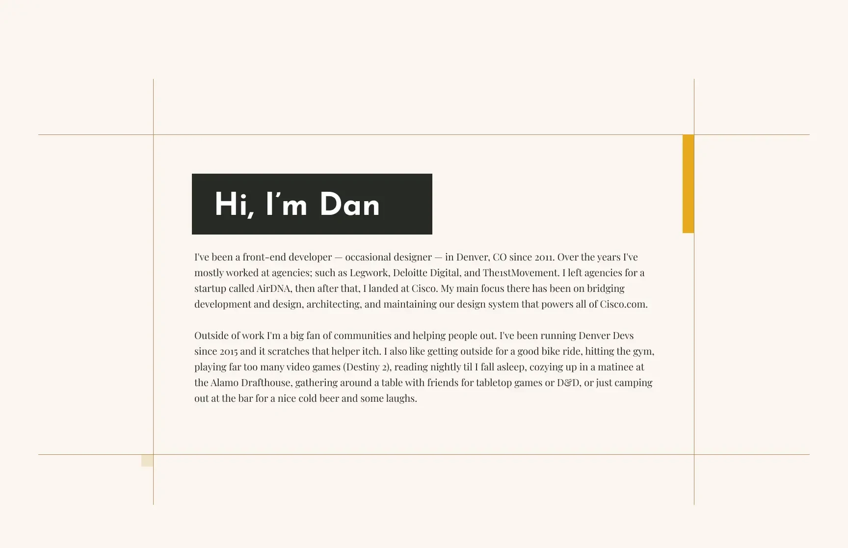
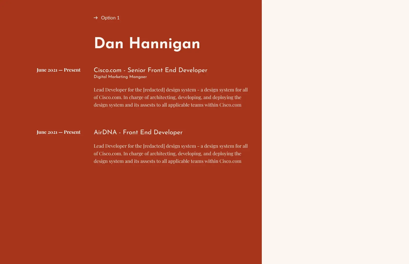
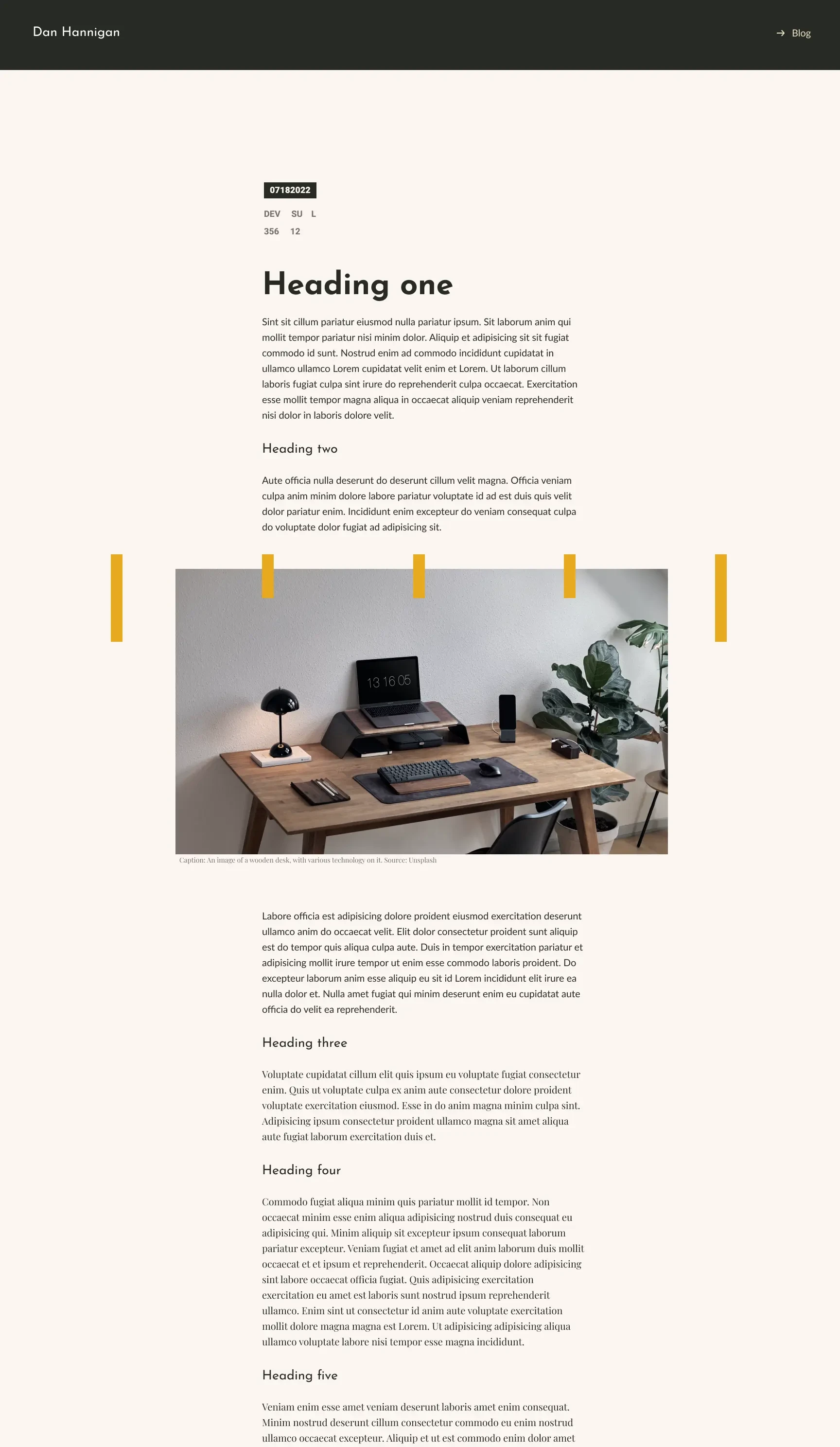
So I dug in further, simplifying the palette and typography - letting the type come to the forefront and pushing back some extraneous elements. The color palette of my "dark mode", with its deep warm grays and blacks contrasted by that marigold, was _very_ much a call to modern Tank cars—those big black tubes with white text and that familiar marigold and it started to really feel right to me. I pulled some ideas together, ultimately simplifying and putting my touch on them.
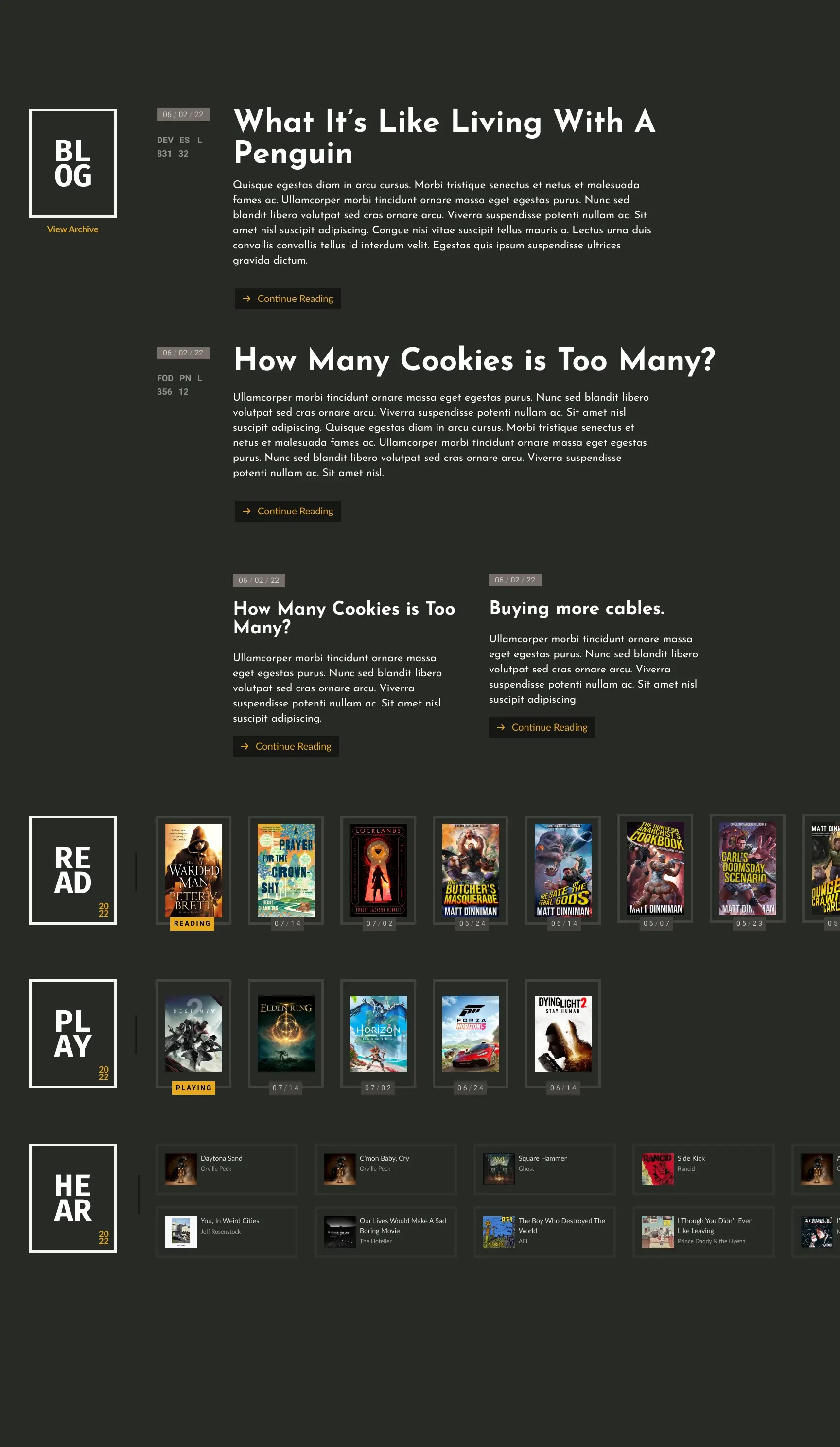
I splashed some transparent overlays in here and there, something of a nod to Apple's design style, which I'm a big fan of, and working with concepts of "materials." For example, I love frosted glass or acrylic, the harshness and softness it creates work nicely with the overall almost brutalist design. You can see this bit of material in the header, and down in the "Read" & "Play" sections of the homepage if you scroll or swipe sideways.
For now, I'm content - but as most designers know, it's hard to rest on one's laurels. So I'll likely come back and tweak and adjust things in the future - or find ways to extend what exists with themes. You'd be surprised how much changing the typeface and a few colors can alter the vibe of a design - and I'm excited to play in this space more.
Member discussion